


What is it that first grabs your attention when you lay your eyes on a product, an advert or another form of marketing?
Is it the words? Is it the slogan? Or, most likely, is it the colours?
Judgments are often made very quickly by customers, and this is usually because of colours. Did you know that:
It’s quite incredible how something as simple as colour can play a part in our lifestyles and purchasing decisions.
This is something the S2F team recently discussed at the office in the Breakfast Club meeting, a weekly gathering where the team dedicates some time to sharing their thoughts on marketing practices, all while enjoying some delicious breakfast from a local eatery.
With bacon, sausage and egg sandwiches in hand (the less said about those who put mayonnaise on top of that, the better…), S2F got together to discuss the use of colours in marketing, and why they are so important.
Needless to say, our eyes were opened! Topics covered ranged from the difference black and white makes compared to full colours, to global corporate giants seeking to break all the rules of advertising and marketing.
However, these were just a few examples of what we found…
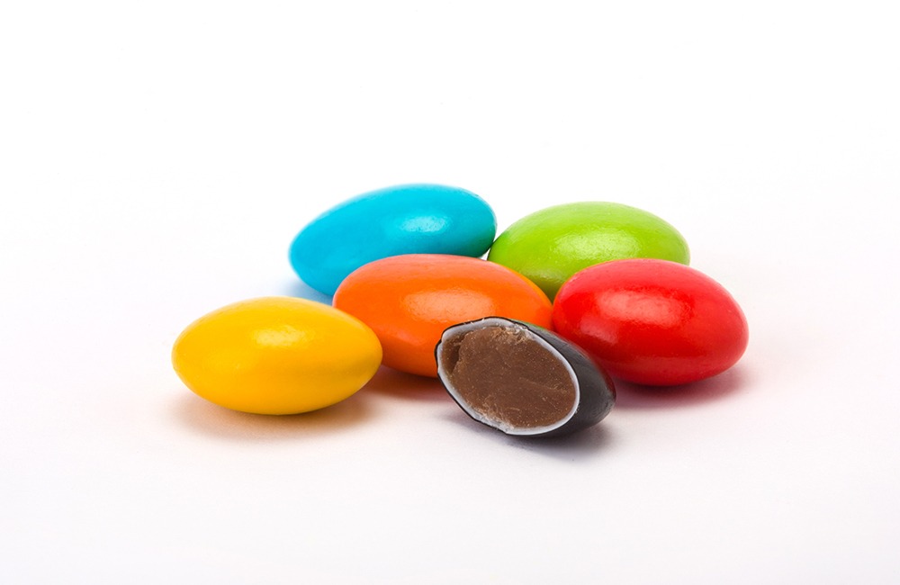
The reason why multiple colours are used in confectionary manufacturing was revealed by Richard Fielding. According to research he found, variety makes you greedy. Using multiple colours in products such as Smarties and M&Ms is a clever strategy that gets you to eat more than you care to admit!
Another interesting statistic that Richard shared was that people tend to overconsume more from a mixed bowl than they would from a bowl full of their favourite colour alone. The University of Cornell also conducted some research that proved you will eat more if your food colour matches the plate you’re eating from, while a plate with contrasting colours will have the opposite effect.
Anyone else hungry suddenly?
Cameron Williams made an interesting comparison that many of us had not thought of: a black and white film or photograph is often more difficult to recall than a colour image. This is because colour, according to scientists, has a stronger appeal to the senses and thus leaves a more lasting impression on the memory.
Cameron then went on to argue against using black and white imagery if you want to leave an impact on your audience. He backed his opinions with facts: the colours determine 85% of people’s purchasing decisions.
So, colour psychology can be an essential tool in making or breaking your business!
Facebook is a global giant, so you would expect them to make decisions based on strategy and algorithms… not on this occasion though!
Shawn Kearney pointed out that the Facebook logo is blue, simply because the founder, Mark Zuckerberg, is red-green colourblind. This means that blue is the clearest colour for him to see! I’m sure not many of us would argue that over the last 15 years or so, blue has become synonymous with brands such as Facebook – that’s the power of marketing for you!

One of the world’s largest companies broke all the rules, according to Kirendeep Virdi.
Google is a rare exception to the unwritten rule that lots of colours can harm your brand image and damage brand recognition. The technology giant uses the mix of colours from its original server’s storage, which was built from oversized Legos. Developed in 1998, they still use the same colour palette today; as recognisable as the first colour chart taught across the world!
Google also purposely broke the rules to make the L in their logo a secondary colour instead. This has always been the ethos of Google: be different and don’t follow the rules. As a result, Google believes its logo is more recognisable amongst a sea of competitors. It seems to have done the trick… the word ‘Google’ is basically a verb now!
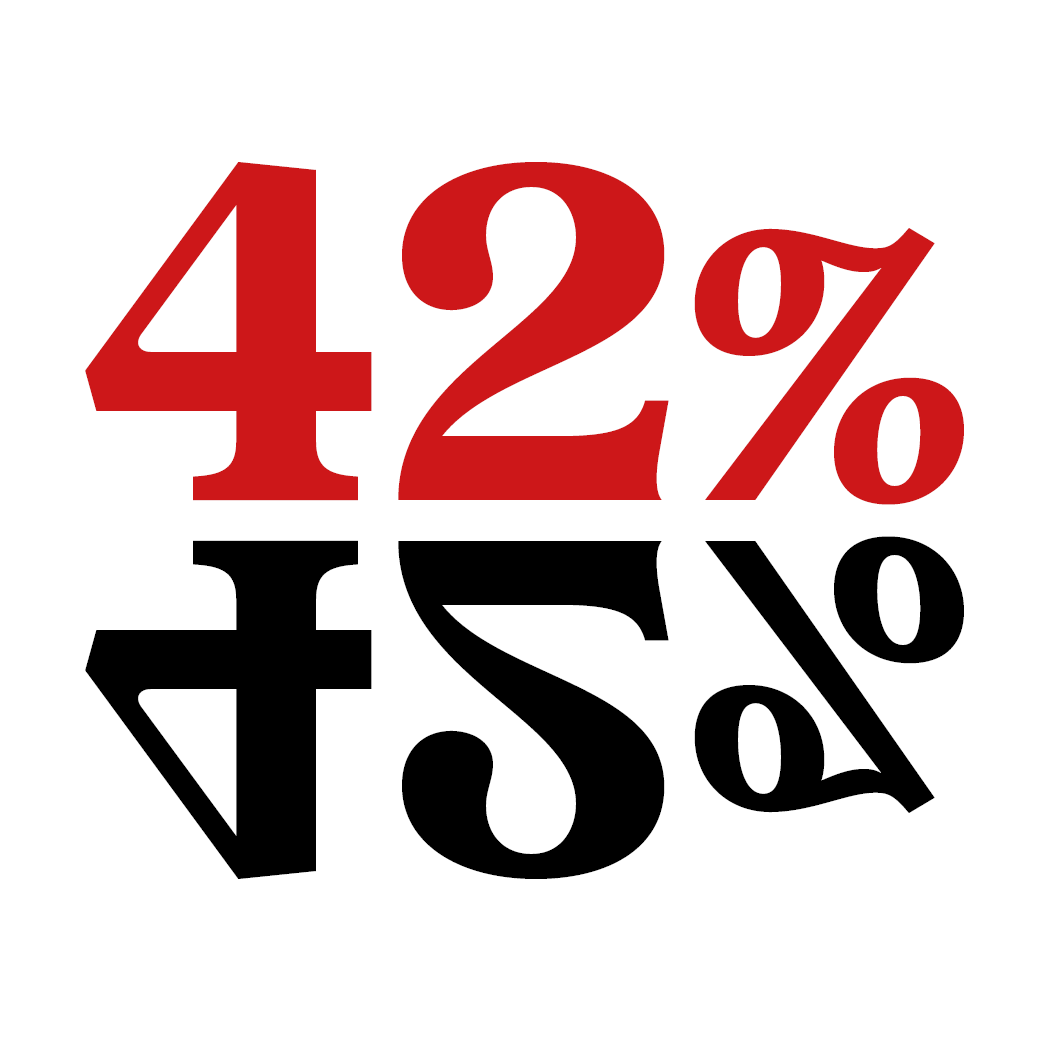
Jo Grainger came up with some interesting research about colours and purchasing decisions. Once a consumer starts looking at an item that includes their favourite colour, a major part of the purchasing decision has already been made. People choose to read ads in colours 42% more than the same ones in black and white, and buyers form mental associations between a product’s colour and price.
Jo also discovered that HubSpot did a call-to-action (CTA) test and found that a red CTA button earned 21% more clicks than a green CTA button. This is because red creates a sense of urgency, hence why many retailers use it on sale signs.
It was revealed by Luke Seager that automotive giants also ignore the experts.
The Fiat logo started in blue in an art nouveau style, with Prussian-blue on gold – as was the style at the time. However, years later, the logo changed to red to express the idea of modernity, technology, dynamism and design of the brand. Fiat then moved back to blue to hark back to their heritage of their first colour logo, with a simplified quadrilateral shape, followed by the return to a circle in 1999.
The Fiat logo started in blue in an art nouveau style, with Prussian-blue on gold – as was the style at the time. However, years later, the logo changed to red to express the idea of modernity, technology, dynamism and design of the brand. Fiat then moved back to blue to hark back to their heritage of their first colour logo, with a simplified quadrilateral shape, followed by the return to a circle in 1999.
In 2006, because of Fiat’s part ownership of Ferrari, they ended up changing the logo’s colour back to red. The move was seen as a return to their 1930s branding, and it is still used to this day.
Some interesting observations about colours for CTA buttons and logos were made by Sam Pickering.
Orange is increasingly used for CTA buttons. Having a mix of characteristics from both red and yellow, orange is traditionally a colour used to attract attention, energise you, and mobilise your resources. This explains its popularity for CTA buttons, even though many would consider orange the most hated colour in the universe! It’s certainly divisive…

Another fact that Sam brought to the table was research showing that 33% of the world’s top brands use blue in their logo. This is because blue stands for integrity, dependability and strength, hence why the likes of Barclays, Dell, HP, NASA and Ford have incorporated the colour into their brand identities for many years.
Or maybe their founders were colourblind too… who knows?!
One of the biggest food brands in the world, if not the biggest, was discussed by Antonio Meitin.
Nobody thinks of the golden arches without thinking of McDonald’s. The fast-food giant’s logo has slightly changed over the years before they settled on what we all recognise now, which came about in 2003.
Shortly after their very first restaurant opened, architect Stanley Clark Meston was hired to update the building. He incorporated two large golden arches on either side of the structure that came through the roof and into the sky. When Ray Kroc took over the business in 1961, he then created a logo that incorporated the two golden arches to form an “M” for McDonald’s.

But wait, there’s more! McDonald’s also chose red and yellow for their brand for scientific reasons. As mentioned prior, red is stimulating and is associated with being active. It also increases heart rate, which helps to jumpstart your appetite. Yellow though, is associated with happiness and is the most visible colour in daylight, hence why a McDonald’s logo is so easy to spot on a crowded road!
At the end of the meeting, Managing Director Warren Albutt explained why S2F Marketing chose purple and gold as the corporate colours for the business.
Initially, Warren gave the reason that purple and gold helps S2F Marketing to stand out from competitors. After all, not many large brands use purple as their dominant brand colour – the two others that spring to mind are Cadbury and FedEx.
However, Warren went deeper into his methodology, and told the team that purple is the colour of royalty, luxury, success, quality, wealth and wisdom. Meanwhile, gold stimulates the mental process, encourages communication, and represents confidence and success. The golden traits are certainly characteristics that the S2F team holds dear and encourages every single day within each other, while the purple attributes of quality, success and wisdom are goals that S2F strives to achieve every single day.
The brains behind marketing will continue to surprise us all with their choice of brand colours, and even more so the reasons behind them. It is not blatantly obvious that the choice of colour for confectionary can make you eat more… but it does. It’s also not a common thought that red can cause such unbridled panic in us, but we all learned something today!
One thing is for certain; from now on, the team at S2F will be examining logos in even more detail and studying the reasons for them. After all, there’s always more to it than meets the eye!
Check back regularly for more Breakfast Club findings! For more news, don’t forget to follow S2F Marketing on LinkedIn, Twitter and Instagram.